Product comparison
research
Background
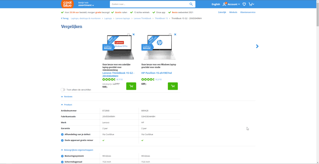
Product comparisons, most web shops have them. They make it possible to compare product attributes between different products. My question is, What makes a valuable product comparison tool?
Sector
E-commerce
Role
In-house UX Designer
Findings
Not needed or ready
Check if you have data to compare on all products, you show attributes in product lists, if people compare your type of products.
Compare ‘button’
9 out of 16 webshops that use a compare feature in the Netherlands have a checkbox and the word ‘Vergelijk’ next to it near the product.
UX Industry Leaders
Instead of re-inventing the wheel, I start off reading articles from UX experts like NN Group, Baymard, and Smashingmagazine to see what they found in their tests. With those articles, you get a good idea of where to start, though you need to verify those findings for your specific audience.
How do people compare?
People, in general, have considered purchases they would like to compare. Those are high-effort purchases, purchases that need time and consideration. For instance a bicycle, laptop, health insurance, or refrigerator. The more expensive the purchase the more time it needs to consider buying the product.
Do you need a product comparison?
While some e-commerce websites want a product comparison just to have one there are a few things to consider before even making one.
1. Are product or service data complete?
All products or services that are comparable need to have their data. When comparing products and there is a lack of attributes, product comparison isn’t helpful at all. For instance, if you want to compare the screen size of a laptop, and the data isn’t available for some laptops, the comparison becomes useless.
2. Have the right attributes in lists?
All products or services that are comparable need to have their data. When comparing products and there is a lack of attributes, product comparison isn’t helpful at all. For instance, if you want to compare the screen size of a laptop, and the data isn’t available for some laptops, the comparison becomes useless.
2. Do people compare your products?
Not every product needs to be compared, some products or services can do without comparison. These usually are things you have multiples of, like a t-shirt, something simple like a coffee mug, something that’s cheap or is easy to replace like a pen or something that is unique or hard to compare like art.
People filter first
When presented with too many options, people tend to filter first. This way they already decide what a product or service needs to have before even considering them to be compared with others.
2 Types of comparison tables
In general, there are two types of comparison tables. One is a static comparison table. These kinds of comparisons have a maximum of 5 preselected items that people can choose from. The other is a dynamic comparison table. These kinds of tables let people select which items to compare. This is usually done when there a more than 5 options available.
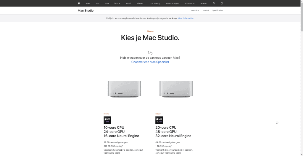
Static comparison
As an example, Apple creates static comparisons showcasing its products in a specific line-up. You can easily read the kind of key features each model has and what is better on one over the other.
Dynamic comparison
A dynamic comparison is user interactive and because of this, there are a few things you should take into account when creating a comparison feature.

Indicator
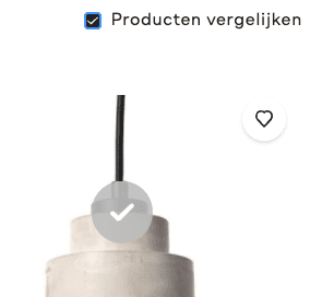
When a product is selected for comparison, there should be a clear indicator that the product has been added to the comparison.
Easy access
When products are selected for comparison it should be easy to access the comparison interface. This can be done to show the access on a prominent place, for instance in the navigation, sidebar, or beside products.
Long lists
Comparison lists that are very lengthy, comparisons that go further than the screen ‘fold’, should have a clear indication of which attributes belongs to which products. Also, the call to action should be available, so that people can directly act based on their decisions.
Don’t make users guess
People using the comparison don’t necessarily need the technical know-how of the products. Consider translating technical terms into something a non-field knowledgeable person would understand. For example on a power bank besides showing the technical term 3350mAh, reflect the number of chargers for a given phone. For instance 1.2 iPhone 6 chargers or 0.8 Samsung S6 chargers.
Sources:
- Designing The Perfect Feature Comparison Table — Smashing Magazine
- UI/UX case study for Car Compare App | by Amit Chakravorty | Prototypr
- Comparison Tables for Products, Services, and Features, Comparing Compare – | UX Magazine
- Comparing products: Design practices to help your users avoid fragmented comparison – Contentsquare
- 3 Product Comparison UX Implementation Details for Designing User-Friendly ‘Compare’ Tools – Articles – Baymard Institute
Competitive analysis
As the NN group states, “Users spend most of their time on other websites”. People prefer to get the same experience and same things on your website as any others. So when designing a solution that already exists keep in mind that people already have some kind of expectation from other websites.
Compare button
As the NN group states, “Users spend most of their time on other websites”. People prefer to get the same experience and same things on your website as any others. So when designing a solution that already exists keep in mind that people already have some kind of expectation from other websites.
With this, in mind, I set out to explore the Dutch webshops to see what the commonly used compare button looks like. The checkmark with the word ‘Vergelijk’ was used by most webshops that have a comparison feature.
Checkbox with word ‘Vergelijk’ in it (9/16)


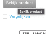


Icon with text (4/16)


Others (3/16)
